“Lessons of Legends” — Redesign of an Educational Platform

Redesign and UI/UX optimization of an online platform where public figures — actors, musicians, directors, and entrepreneurs — share their expertise through video courses.

Redesign and UI/UX optimization of an online platform where public figures — actors, musicians, directors, and entrepreneurs — share their expertise through video courses.

Role: UI/UX Designer, Art Direction

UI

UI

UI

UX

UX

UX

Web

Web

Web

Design System

Design System

Design System

EdTech

EdTech

EdTech

Art Direction

Art Direction

Art Direction

Context and Task

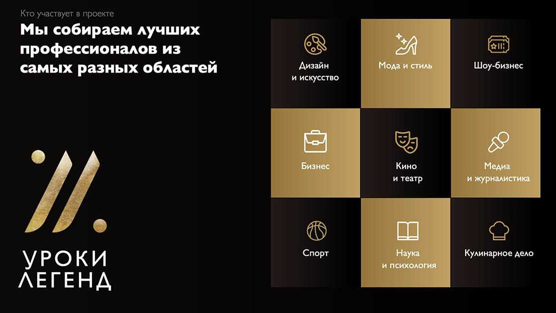
“Lessons of Legends” is a self-development and creativity platform that combines educational and entertainment content.

The project already had an existing website, but its visual style created an impression of “flashy luxury” and didn’t inspire trust among the target audience.

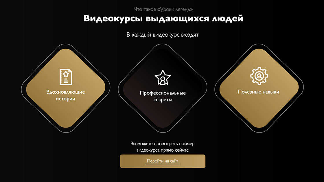
The goal was to refresh the visual language and UX, making the platform modern, lightweight, and motivating to learn.

Research and Preparation

We analyzed visual and behavioral patterns from EdTech and media platforms — Netflix, MasterClass, Steam.

We analyzed visual and behavioral patterns from EdTech and media platforms — Netflix, MasterClass, Steam.

We analyzed visual and behavioral patterns from EdTech and media platforms — Netflix, MasterClass, Steam.

The goal was to shape an edutainment approach — so that the site evoked not associations with academic study, but with the pleasure of discovery.

The goal was to shape an edutainment approach — so that the site evoked not associations with academic study, but with the pleasure of discovery.

The goal was to shape an edutainment approach — so that the site evoked not associations with academic study, but with the pleasure of discovery.

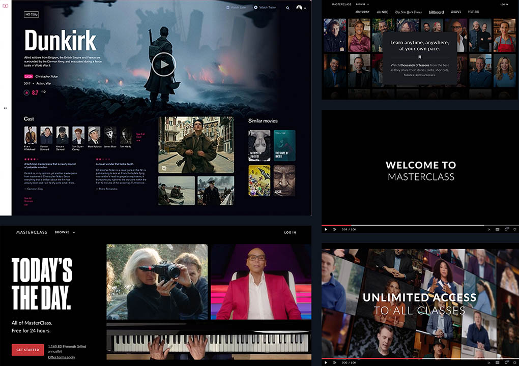
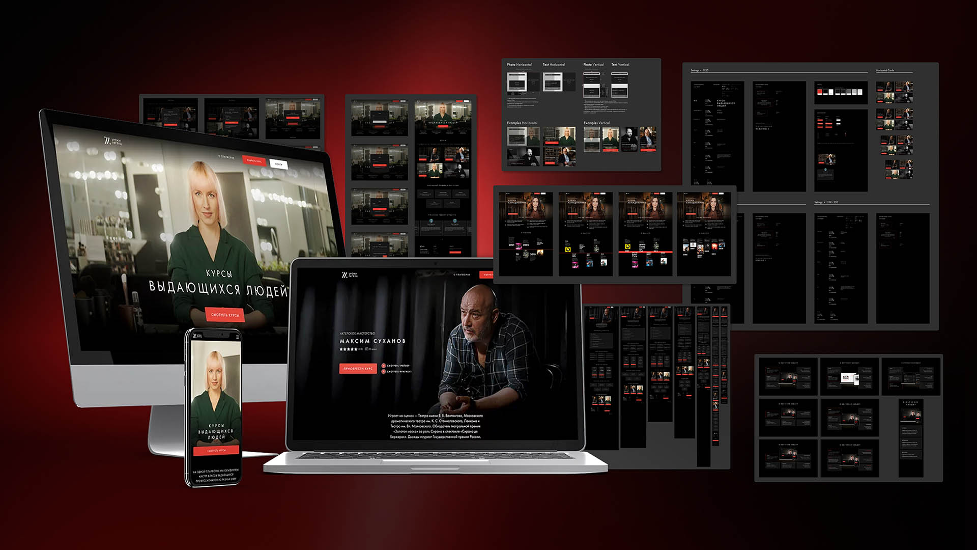
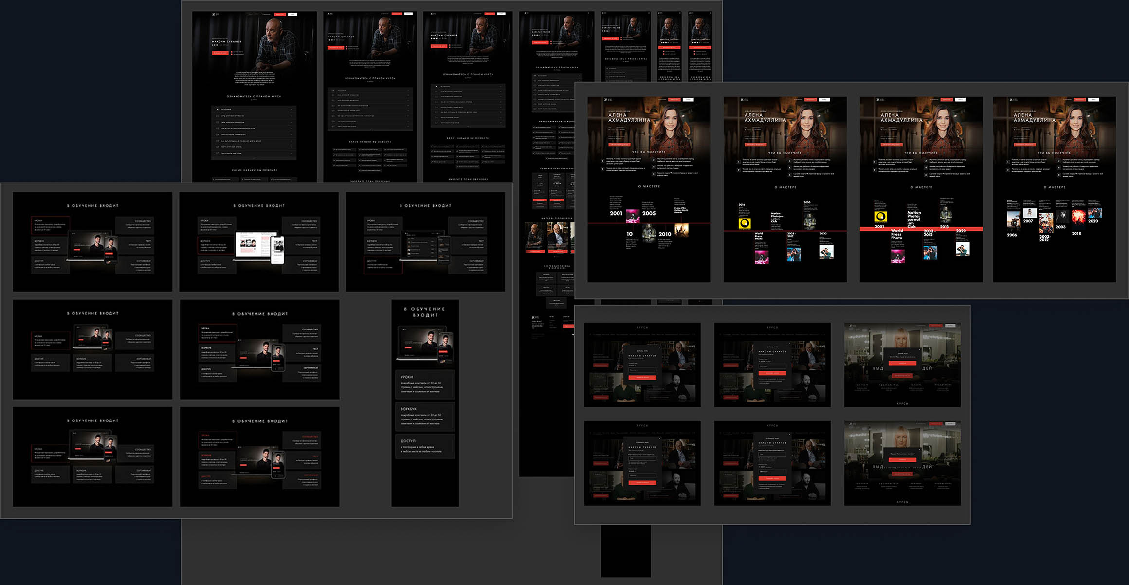
New Visual Style and UI Approach

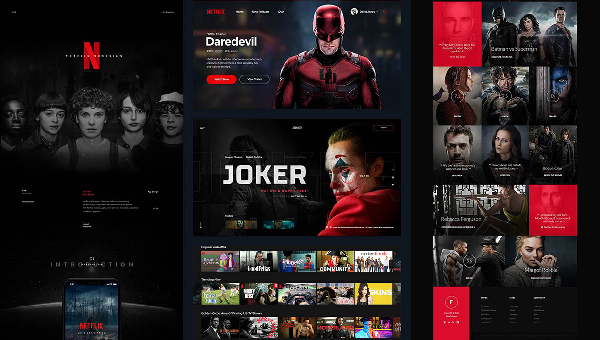
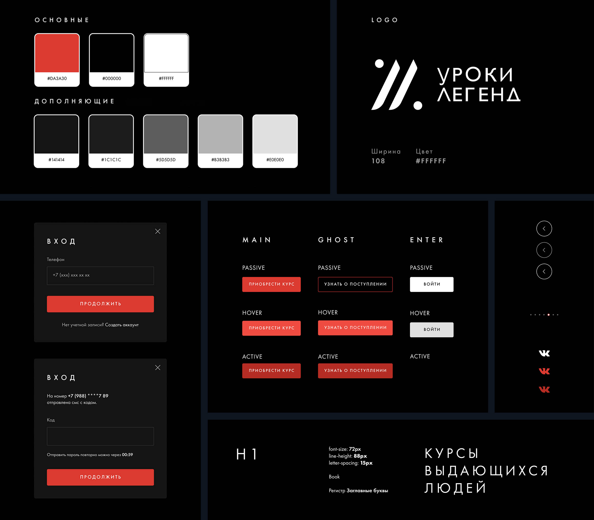
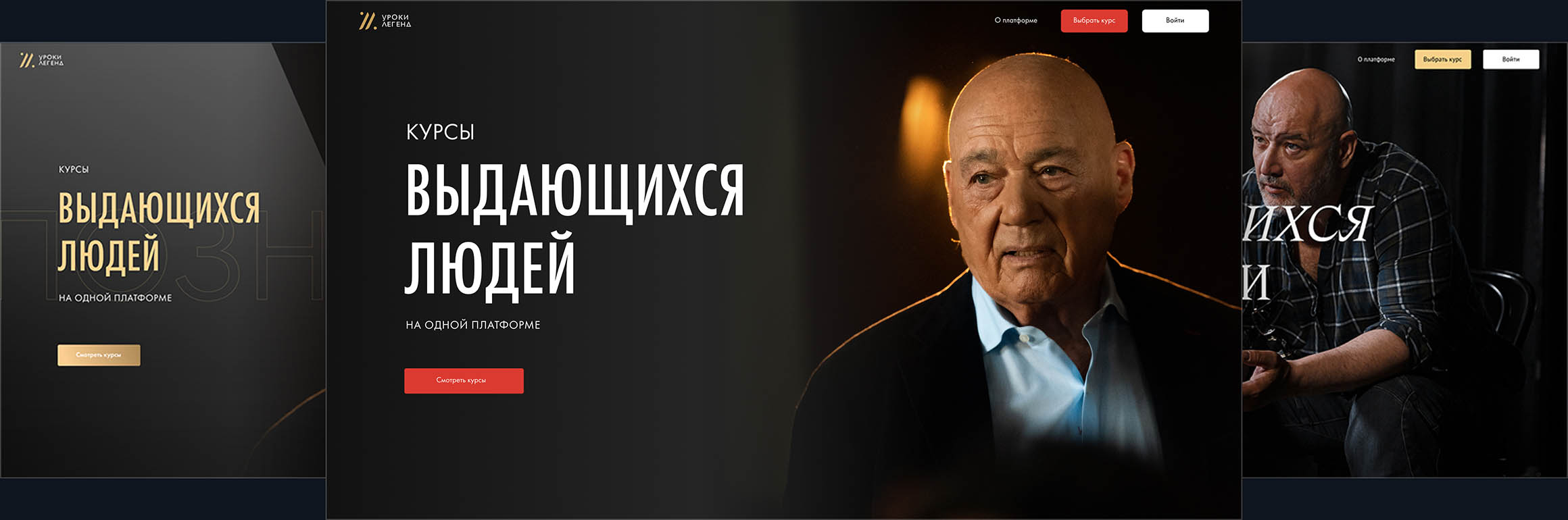
I developed a new visual concept inspired by modern media services: dark background, minimalist typography, and an accent color to guide user attention.

The dark palette highlights video quality and conveys a sense of premium aesthetics without excessive gloss.

The dark palette highlights video quality and conveys a sense of premium aesthetics without excessive gloss.

The dark palette highlights video quality and conveys a sense of premium aesthetics without excessive gloss.

By carefully balancing contrast and composition, I created a modern UI where content and speakers stay in the spotlight.

By carefully balancing contrast and composition, I created a modern UI where content and speakers stay in the spotlight.

By carefully balancing contrast and composition, I created a modern UI where content and speakers stay in the spotlight.

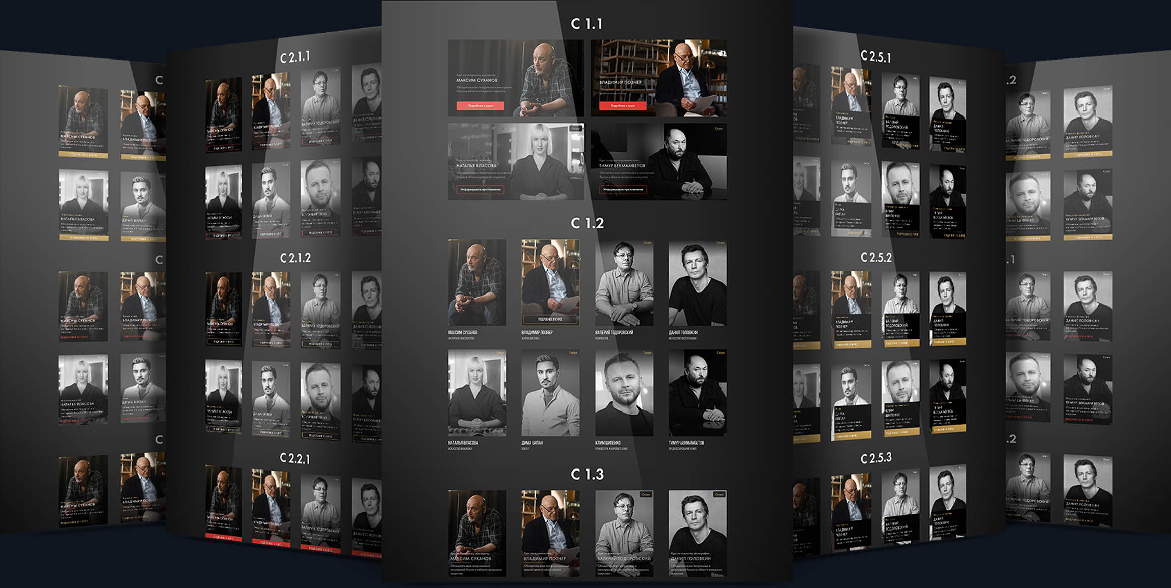
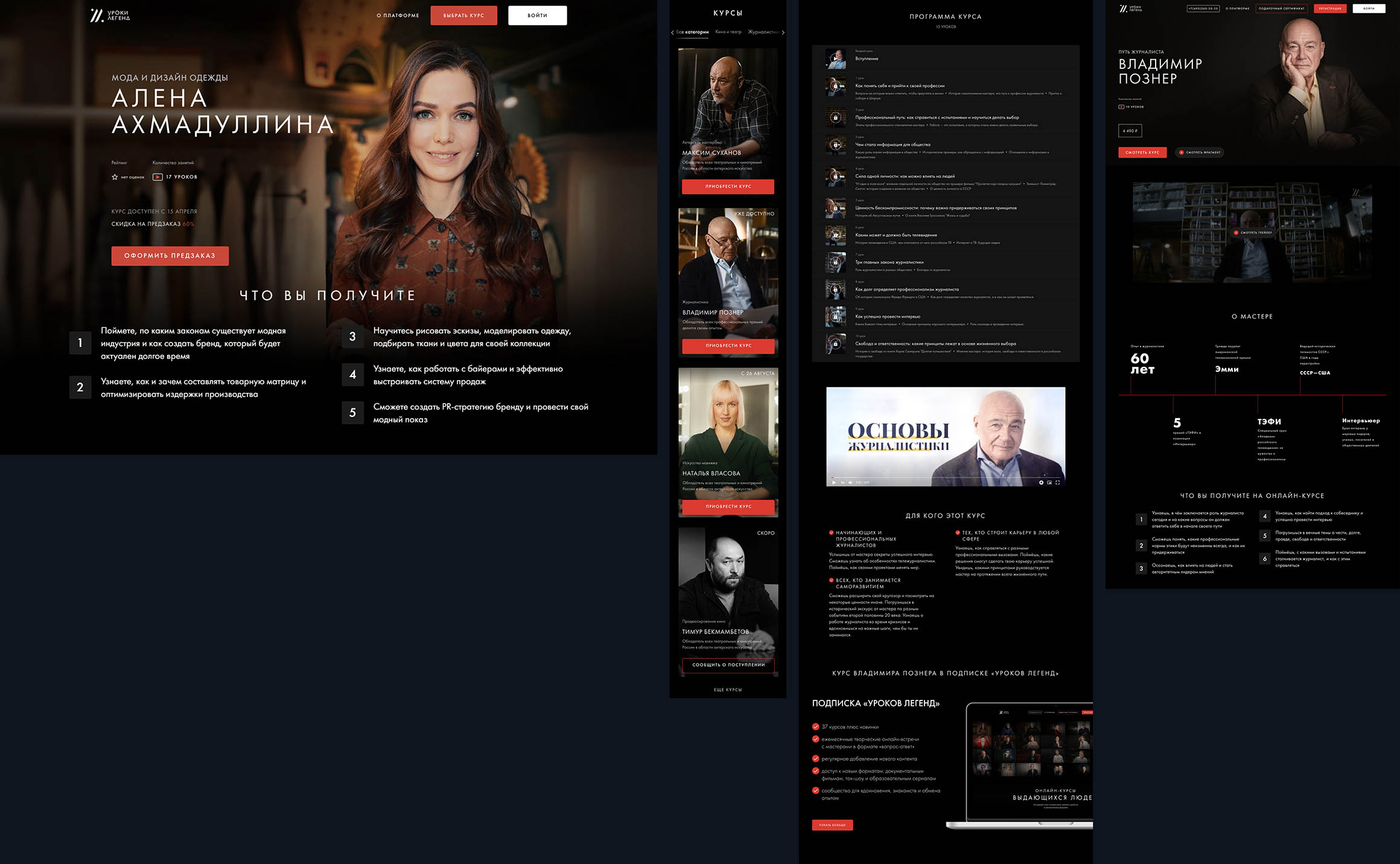
UX and Page Structure

I developed UX architecture for the homepage, speaker profiles, and course pages.

I developed UX architecture for the homepage, speaker profiles, and course pages.

I developed UX architecture for the homepage, speaker profiles, and course pages.

The main focus was on storytelling through visuals and on the featured experts.

The user can easily navigate between sections without losing learning context.

Special attention was given to the balance between text and video previews, enhancing the feeling of “live content.”

Special attention was given to the balance between text and video previews, enhancing the feeling of “live content.”

Special attention was given to the balance between text and video previews, enhancing the feeling of “live content.”

Design System and Guidelines

I created a modular design system and prepared guidelines for the client’s internal team, including:

I created a modular design system and prepared guidelines for the client’s internal team, including:

I created a modular design system and prepared guidelines for the client’s internal team, including:

Rules for processing speaker photos

Rules for processing speaker photos

Rules for processing speaker photos

Unified course card format

Unified course card format

Unified course card format

Principles of adaptive layout

Principles of adaptive layout

Principles of adaptive layout

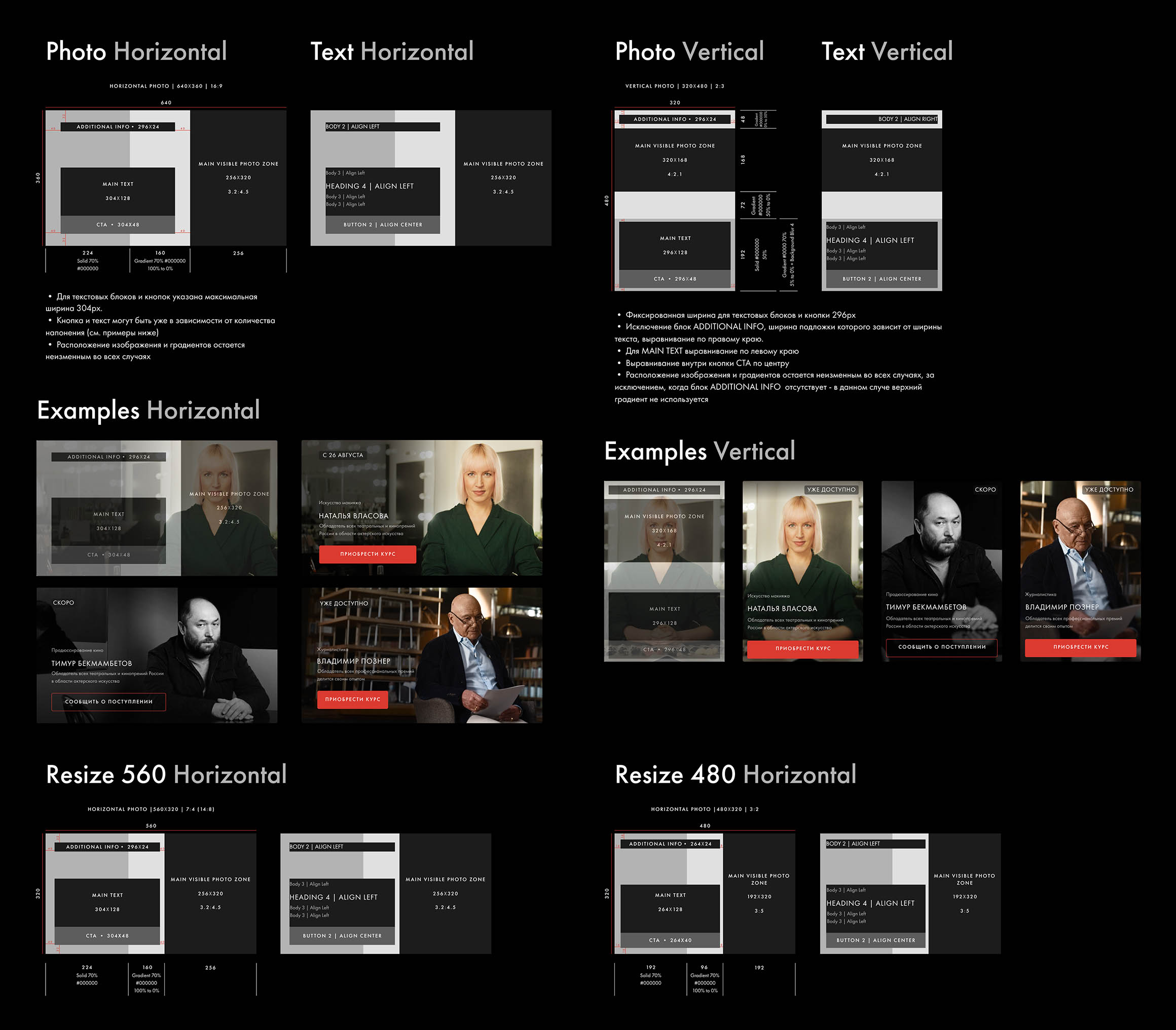
This system enabled the client’s team to add new courses independently while maintaining consistent visuals and interface quality.

Result

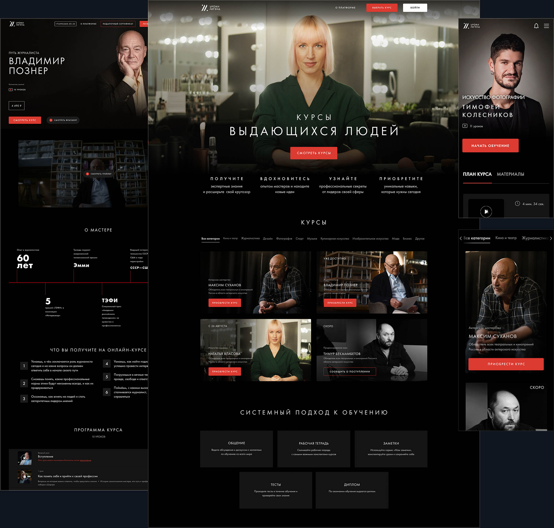
The updated site became closer to modern media platforms: intuitive UX, clean UI, and a well-structured visual hierarchy increased user engagement.

The platform is now associated with high-quality content and serves as a strong foundation for future project growth.

The platform is now associated with high-quality content and serves as a strong foundation for future project growth.

The platform is now associated with high-quality content and serves as a strong foundation for future project growth.

Detailed guides and the design system are still being used by the client’s team for new course launches.

Detailed guides and the design system are still being used by the client’s team for new course launches.