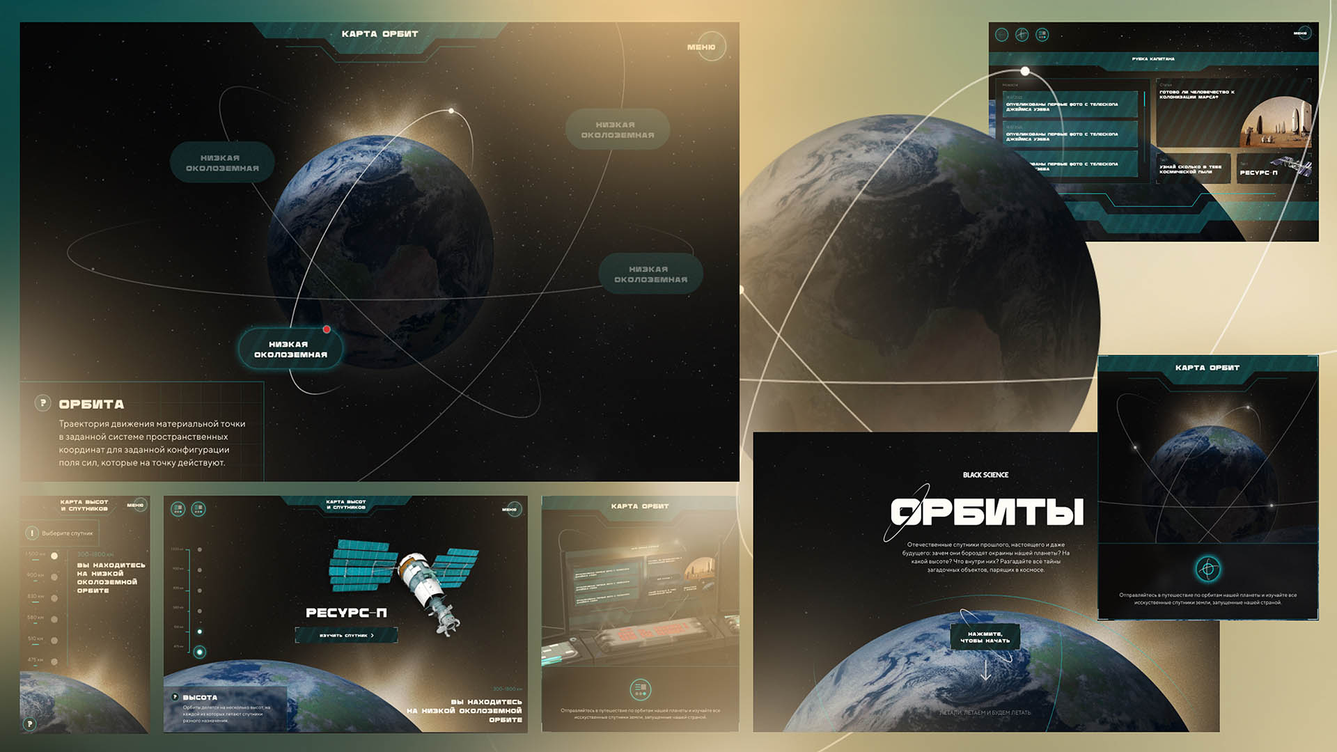
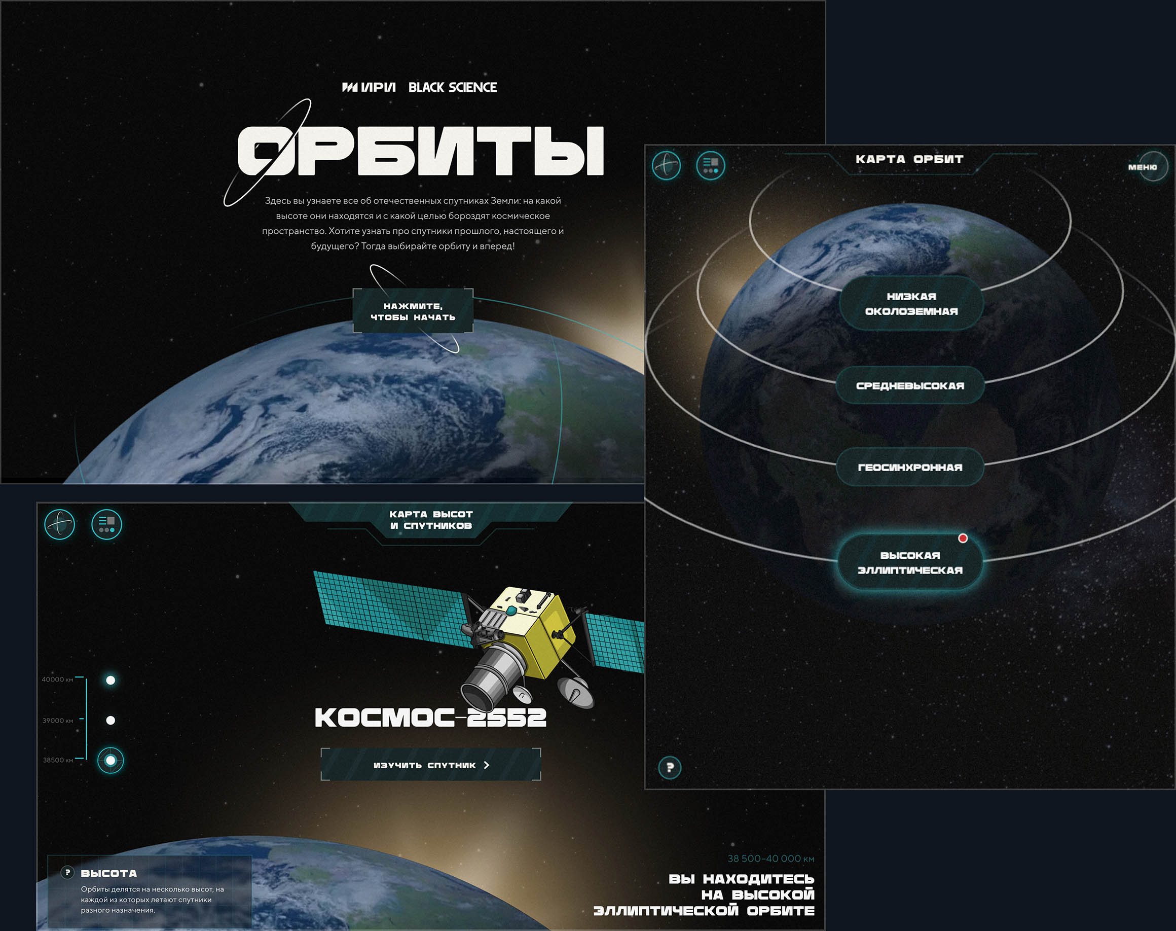
“Orbits” — Interactive Infotainment Project about Earth’s Satellites
Design and UX development of a multimedia special project for Black Science Media and the Internet Development Institute.
The portal tells the story of Russian satellites — their history and technology — through interactive storytelling, visual design, and gamified elements.
Role: UI/UX Designer, Art Direction
UI
UX
Interactive
Storytelling
Edutainment
Art Direction
Context and Task
The project needed to combine scientific content with visual drive — explaining complex technical topics through an engaging interface and modern visual language.
The project needed to combine scientific content with visual drive — explaining complex technical topics through an engaging interface and modern visual language.
The project needed to combine scientific content with visual drive — explaining complex technical topics through an engaging interface and modern visual language.
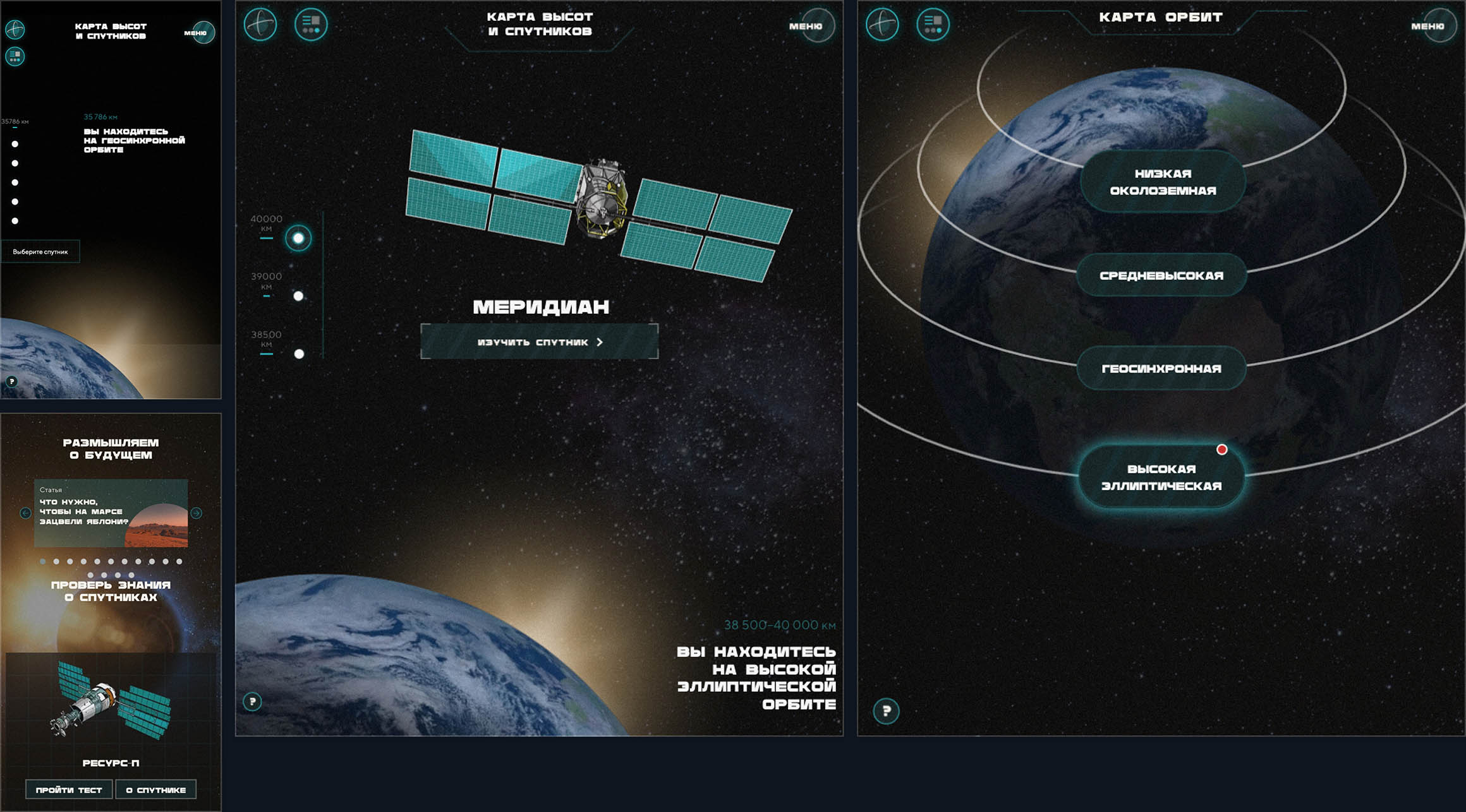
The site unites two parts:
An interactive orbit map
An interactive orbit map
An interactive orbit map
A media section with articles, news, and quizzes
A media section with articles, news, and quizzes
A media section with articles, news, and quizzes
The goal was to make scientific storytelling accessible and inspiring for a broad audience.
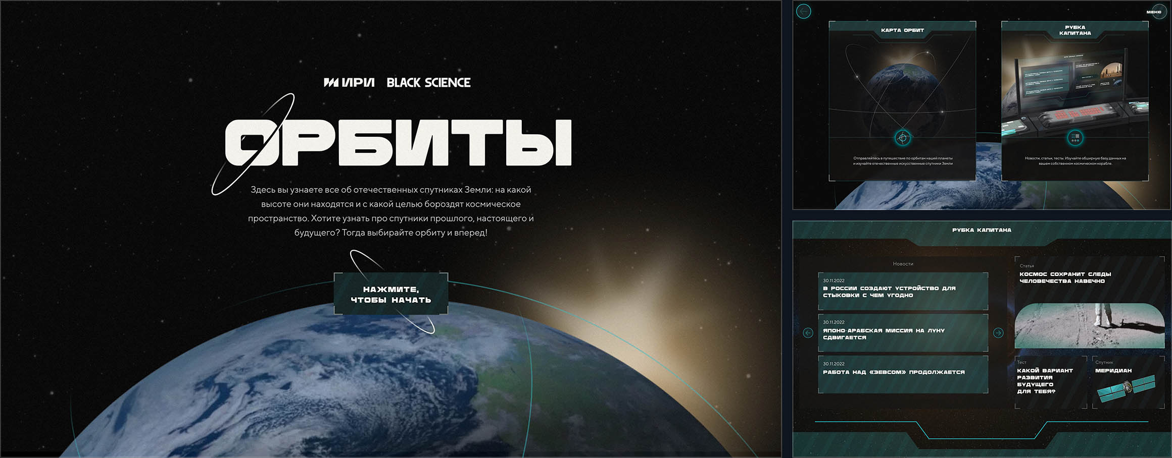
Idea and Visual Concept
The work began with finding a visual language that reflected the theme of space and technology while remaining warm and human.
The work began with finding a visual language that reflected the theme of space and technology while remaining warm and human.
The work began with finding a visual language that reflected the theme of space and technology while remaining warm and human.
After exploring several directions, the team settled on retro-futurism — the aesthetics of 20th-century sci-fi interfaces.
After exploring several directions, the team settled on retro-futurism — the aesthetics of 20th-century sci-fi interfaces.
After exploring several directions, the team settled on retro-futurism — the aesthetics of 20th-century sci-fi interfaces.
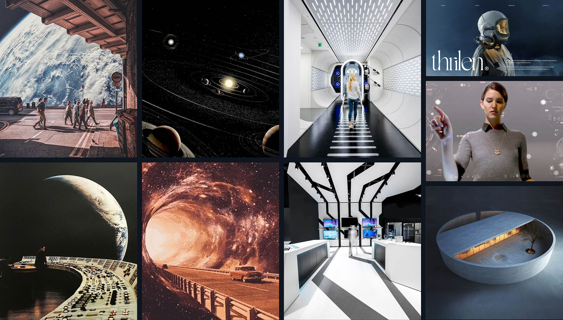
Muted warm colors, subtle textures, and bold typography evoke nostalgia, while futuristic UI details add a sense of motion and discovery.
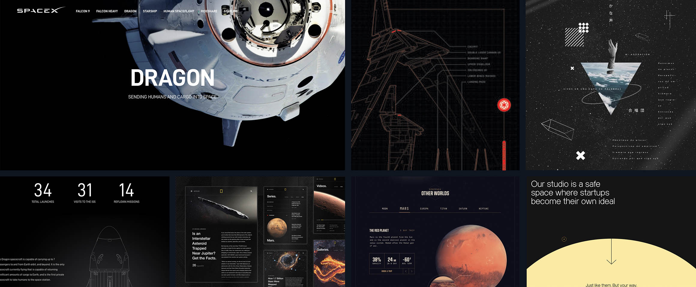
The resulting visual style blends science fiction with documentary realism — creating a balance between wonder and credibility.
The resulting visual style blends science fiction with documentary realism — creating a balance between wonder and credibility.
The resulting visual style blends science fiction with documentary realism — creating a balance between wonder and credibility.
UX and Portal Structure
The client already had an initial vision of the portal’s content and features.
We reworked the original structure to make it simpler and more intuitive.
The client already had an initial vision of the portal’s content and features.
We reworked the original structure to make it simpler and more intuitive.
The client already had an initial vision of the portal’s content and features.
We reworked the original structure to make it simpler and more intuitive.
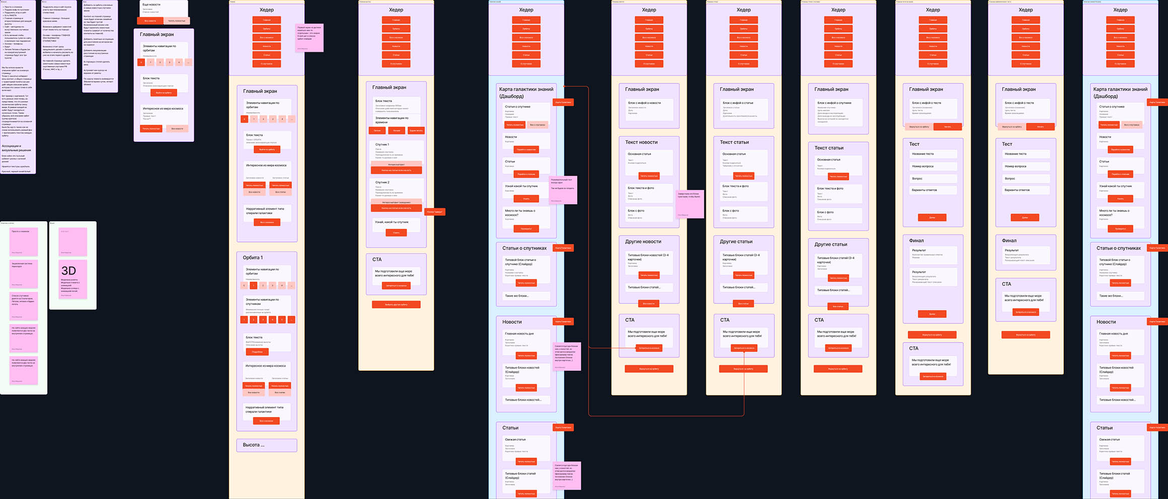
Because the interface was tightly integrated with the visual layer, we created detailed wireframes that already included 3D satellite models and the orbit map.
Because the interface was tightly integrated with the visual layer, we created detailed wireframes that already included 3D satellite models and the orbit map.
Because the interface was tightly integrated with the visual layer, we created detailed wireframes that already included 3D satellite models and the orbit map.
Early UX tests revealed some cognitive load issues, so we refined the flow:
Split information across more screens
Split information across more screens
Split information across more screens
Added contextual hints and smooth animations
Added contextual hints and smooth animations
Added contextual hints and smooth animations
Designed the interface to “tell a story step by step”
Designed the interface to “tell a story step by step”
Designed the interface to “tell a story step by step”
Thus emerged a narrative UX — where the user’s path unfolds like a journey through the orbits.
Thus emerged a narrative UX — where the user’s path unfolds like a journey through the orbits.
Thus emerged a narrative UX — where the user’s path unfolds like a journey through the orbits.
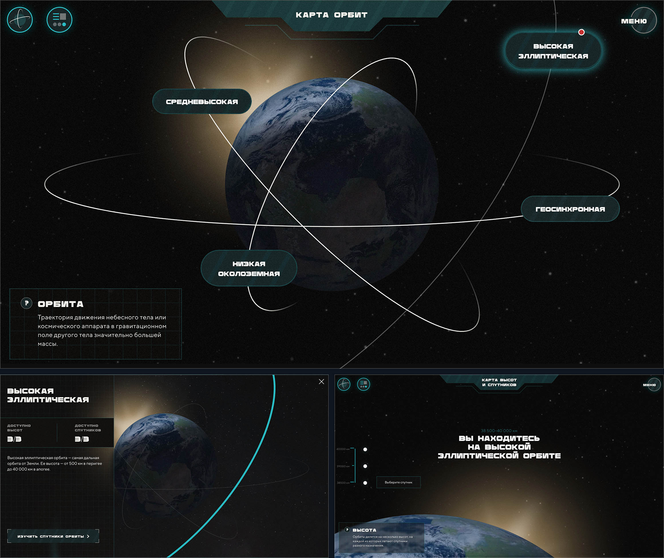
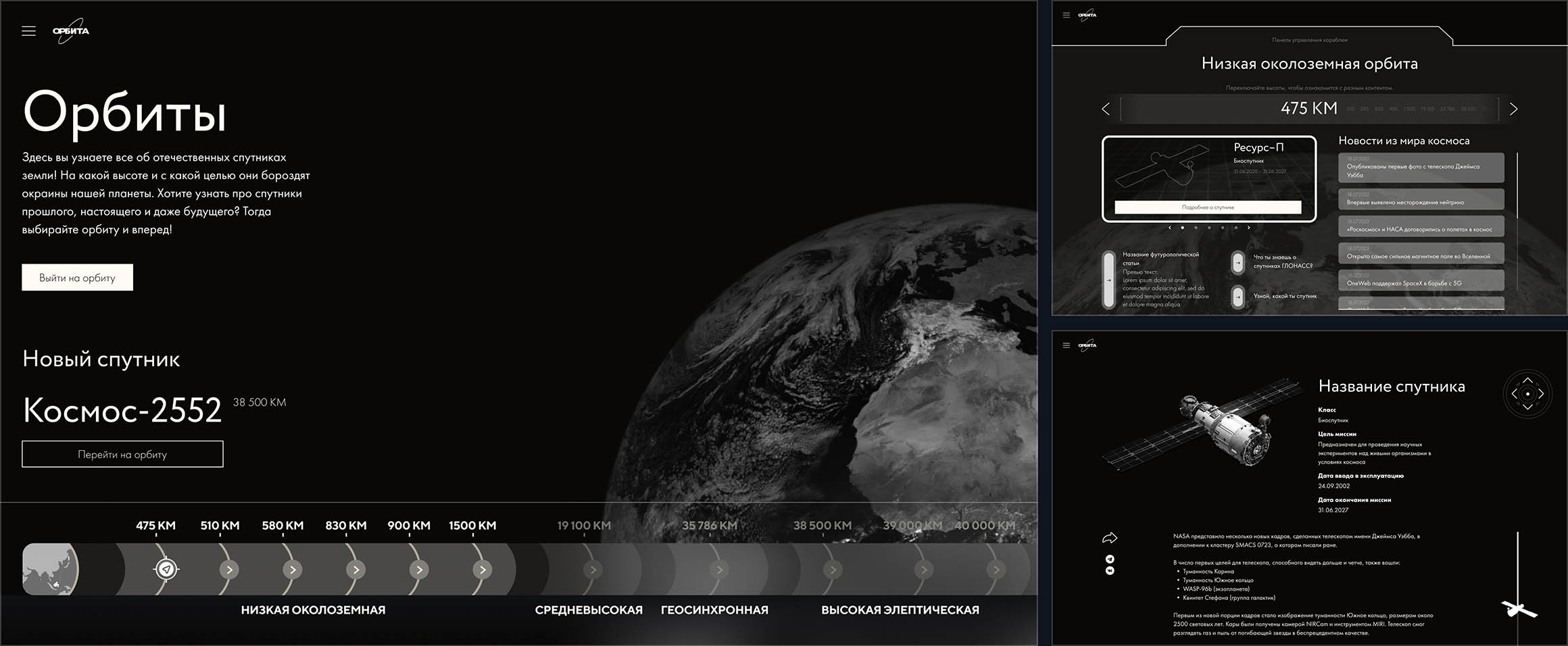
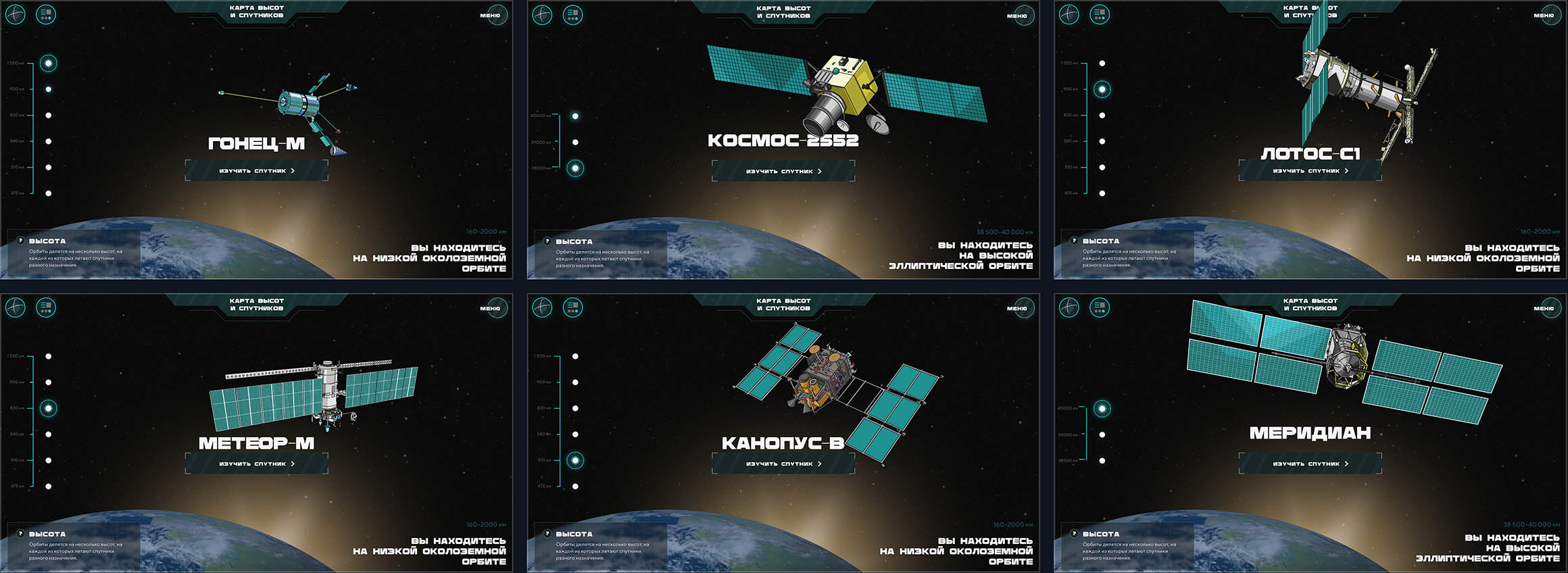
UI and Visual Style
UI design was based on the concept of a spaceship control panel:
UI design was based on the concept of a spaceship control panel:
UI design was based on the concept of a spaceship control panel:
Large typography and grid resembling instrument displays
Large typography and grid resembling instrument displays
Large typography and grid resembling instrument displays
Retro-style graphics and satellite illustrations inspired by old technical manuals
Retro-style graphics and satellite illustrations inspired by old technical manuals
Retro-style graphics and satellite illustrations inspired by old technical manuals
Strong light-shadow contrasts creating a sense of depth
Strong light-shadow contrasts creating a sense of depth
Strong light-shadow contrasts creating a sense of depth
The result combines realism, minimalism, and sci-fi detailing, making the interface feel alive and interactive.
The result combines realism, minimalism, and sci-fi detailing, making the interface feel alive and interactive.
The result combines realism, minimalism, and sci-fi detailing, making the interface feel alive and interactive.
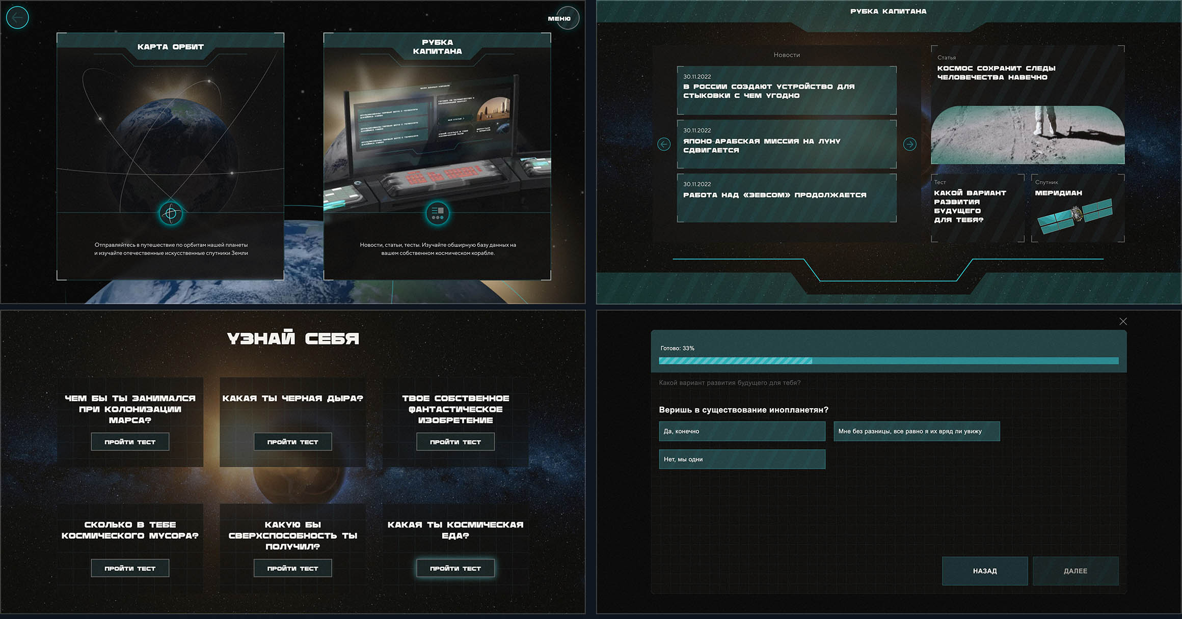
Navigation and Interactivity
Navigation is built as a space journey: users choose an orbit, explore satellites on it, and open additional materials inside the “captain’s cabin.”
Navigation is built as a space journey: users choose an orbit, explore satellites on it, and open additional materials inside the “captain’s cabin.”
Navigation is built as a space journey: users choose an orbit, explore satellites on it, and open additional materials inside the “captain’s cabin.”
To sustain engagement, we added micro-interactions, smooth transitions, and playful elements — like light quizzes (e.g., “What kind of space food are you?”).
To sustain engagement, we added micro-interactions, smooth transitions, and playful elements — like light quizzes (e.g., “What kind of space food are you?”).
To sustain engagement, we added micro-interactions, smooth transitions, and playful elements — like light quizzes (e.g., “What kind of space food are you?”).
The responsive design dynamically scales visual elements across devices while preserving immersion and storytelling flow.
The responsive design dynamically scales visual elements across devices while preserving immersion and storytelling flow.
The responsive design dynamically scales visual elements across devices while preserving immersion and storytelling flow.
Result
The project reached over 300,000 unique visitors in its first few months, with an average session time of 6 minutes.
The project reached over 300,000 unique visitors in its first few months, with an average session time of 6 minutes.
The project reached over 300,000 unique visitors in its first few months, with an average session time of 6 minutes.
“Orbits” became an example of how scientific content, design, and UX storytelling can merge into a unified edutainment experience — helping popularize Russian space science among younger audiences.
“Orbits” became an example of how scientific content, design, and UX storytelling can merge into a unified edutainment experience — helping popularize Russian space science among younger audiences.
“Orbits” became an example of how scientific content, design, and UX storytelling can merge into a unified edutainment experience — helping popularize Russian space science among younger audiences.